14 Mei 2010

Tutorial - Edgy Style Photo Treatment

Share
Tutorial - Edgy Style Photo Treatment
from : Apil


Step 1

Open the photo you want to apply the effect in Photoshop.


Step 2

Duplicate Background Layer.


Step 3

Go to Image>Adjustments>Hue and Saturation (CTRL/CMD+U). Use -60 for the Saturation.


Step 4

Go to Layer>New Adjustment Layer>Gradient Map. Use Black and White for the colors and change the Blend Mode to Soft light.


Step 5

Select the Brush Tool (B) and use a Hard Edged brush at 30% opacity and paint some light back into the iris by just painting over the layer mask of the adjustment layer.


Step 6

Create a new layer and fill with 50% gray and set the Blend Mode to overlay. Also use Dodge Tool to bring out eyes. Use Midtones and 60% exposure then repeat steps 5 & 6 except use a smaller brush and focus on more detailed areas to bring out.


Step 7

Create a new gradient fill layer and set to angle gradient. invert layer mask and paint the iris. Set Blend Mode to Color. Opacity: 50%


Step 8

Apply image to a new layer Ctrl/Cmd + shift + alt/opt + e. Set to Overlay the Blend Mode, then go to Filter>Other>High Pass with a radius of 5.


Conclusion

Here's the final result. You can use different colors or even add some glow, now it's up to you.

Watercolor Effect in Photoshop

Share
TUTORIAL : Watercolor Effect in Photoshop
FROM : APIL

So in this tutorial we will use Photoshop,
some brushes from Brusheezy and some stock photos.


Step 1

Open Photoshop and create a new document, I'm using 1920x1200 pixels.


Step 2

Add a new layer, fill it with white then make sure you have black and white for the foreground and background colors. Then go to Filter>Texture>Texturizer. Use Canvas for the Texture, 75% for the Scaling, 3 for the Relief and for the Light choose Top Right.


Step 3

Let's add a nice texture. You can use the image of your choice it could be parchment paper for example. I'm using a image from Shutterstock that you can buy it at: http://www.shutterstock.com/pic-20845342-old-yellow-paper-background-with-scratches.html

Place the image in the document on top of the other layers. After that, change the Opacity to 75%.


Step 4

Now let's place an image in our document. I'm using a photo of a guy walking in the field from Shutterstock, you can get it there. The image has to go beneath the texture layer. After that go to Layer>Group Layer. The layer of the image will be inside a folder in the Layer Palette. Select the folder and go to Layer>Layer Mask>Hide all.


Step 5

The image is hiding because of the mask. So now, let's use some Watercolor Brushes. The ones I use are from Brusheezy and you can download them here http://www.brusheezy.com/brushes?search=watercolor.

So select one of the watercolor brushes and them white for the color and paint on the layer mask of the group. You will notice that the image will start showing.


Step 6

Pick another Brush and paint again.


Step 7

Keep painting untill you can see the image without losing the brush splatters.


Step 8

Now add another layer, this time beneath the Folder that the image is in. Then again using the watercolor brushes paint over the layer using colors like: pink, blue and yellow. Use the image below for reference.


Step 9

Let's just adjust the color of the image. Select the image and go to Image>Adjustment>Photo Filter. Select Warning Filter (85) and 55% for the Density. Also select the Preserve Luminosity option


Step 10

Select the image and go to Filter>Artistic>Dry Brush. Use 0 for the Brush Size, 9 for the Brush Detail and 1 for the Texture.


Conclusion

Just place your logo and that it you will have a really cool effect and super simple to achieve. That can be used for website headers to create a simply awesome design, and, of course to create posters. Also you can reduce the opacity of the paper texture. I reduced to 50%, that way we can drive the viewer's attention to the watercolor effect.

Reader Tutorial: Easy HDR Technique

Share
Easy HDR Technique
FROM : APIL

We start from this original picture, I took on a night in Milano. First, we want to add some cool night tint to this. So, we lower the Temperature a bit, let’s say -32 and play with the other sliders as you see fit.

Original Image
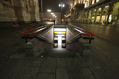
Don’t worry about the settings, you can’t do much wrong. We’ll return to Lightroom later and correct everything that doesn’t look right. Always remember the great J key, that can show you when you are losing details in high- lights and shadows.


Step 1

First of all, we start into Lightroom. I am a big fan of it. The Lightroom 3 beta is free on Adobe, so you might want to download that. It’s a great, great tool that makes your job easier.
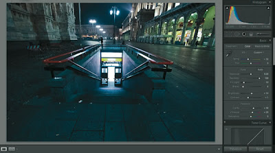


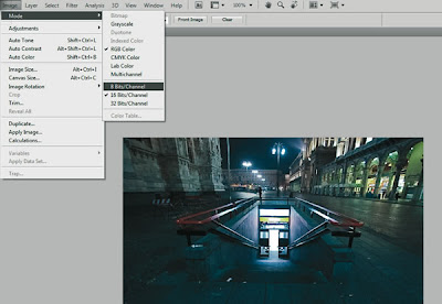
Step 2

Now export it into Photoshop. Here, don’t forget to make it 8 bits / Channel, so you can save it as a jpeg. Save this image, with your Lightroom adjustments.


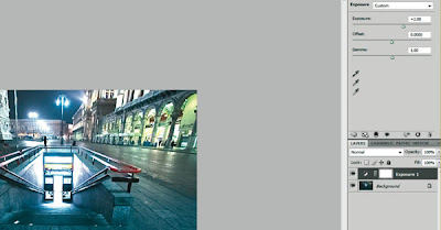
Step 3

Overexpose and underexpose the image by 2 points and save each version with a different name, so now you have 3 images with different exposures [+2,0,-2]
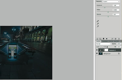


Step 4

Now open Photomatix, hit Generate HDR, browse and select your 3 photos. Specify exposure manually, if Photomatix does not auto-detect it. I use these settings, but you probably shouldn’t worry about this.
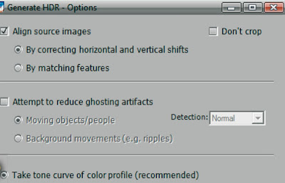


Step 5

Click OK and now you will see a crappy image. This is because your monitor cannot display HDR. Don’t worry about it, it’s alright. Hit the Tone Mapping button on the bottom.

Now, for the settings, you should keep Strength at 100%, the Color Saturation at 40-60 [I keep it at 50 for this specific image], just try not to over-saturate the image. You can add saturation at any time later. For the Light Smoothing, it should be 4 or 5, any less will give you a very surrealistic image that is not very cool. Play with Luminosity as you see fit.

Be careful about the histogram you see there, so you have it inside the frame, if it bleeds out, you’re losing light. Shout out to Trey Ratcliff for teaching me that. For the other settings, Tone, Color, Micro and S/H, play with them as your eye sees fit. There should be no right and wrong as you try not to overdo things. I usually play only with the white and black point and leave the rest on default. Hit Process and save the HDR.
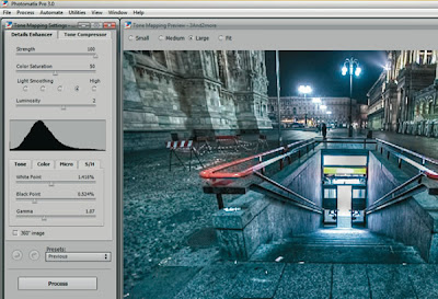


Step 6

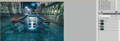
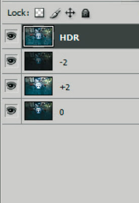
Now comes the part when you have to work a little, that part where the difference is made between all those fake HDRs generated by plugins and the real thing. Bring all 4 images into Photoshop and align them on top of each other, with the HDR on top. I usually have my -2 layer under my HDR, my +2 and then my 0 in the end. I don’t think this makes a huge difference though.
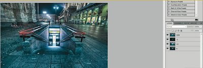


Step 7

Add a mask on the top layer, using that button below the Layers panel. With a 10-50 black soft brush, start painting on the layer mask, so that the -2 shines through. For this picture, paint the ground and the buildings, so you add a little more depth to the shadows. Also, if those street lights are too strong for your taste, paint on them, too. When done, just merge the 2 layers, CTRL+E, and add a mask to the new layer, that has the +2 layer beneath it. In the same way you did above, bring some highlights in now, Don’t worry about mistaking, since you are painting on a mask and you can always add back by using a white brush. If you don’t like merging the layers, create a duplicate and hide it, before merging it, just so you work non-destructively at any time. I hope this makes sense.

Continue until you flatten the whole image. Now you should use a software like Noiseware Professional or the old fashioned G. Blur, cause HDR’s tend to create tons of noise.


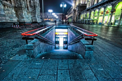
In the end, bring your picture into Lightroom again for final adjustments (maybe some exposure or tint).


Conclusion

If you’re still not satisfied completely, bring it again into Photoshop and do some dodging and burning with a soft low opacity brush. Or create a new layer above, set it to overlay, 30% opacity, and paint with a soft white brush for highlights and black for shadows.

6 Mei 2010

fanatik bola

Share
aku tak paham part ni..
kenape ramai yang beriya-iya sokong
kelab luar smpai mcm ade share profit..
soul gile, smpai bertumbuk, hilang kawan..
WTF!!.. dah la kelab luar pulak tu..
xde kene mengena langsung dgn salasilah kluarge lu orang
jgn jadi benak la nk beriya.. ISH!! ade yg kene tumbok ni karang!!

menyampah aku tengok..
aku layan gak..
menang xpe, kalah pn xpe..
xde efek pun.. wa xrugi. .
tp wa berbulu tgk lu orang yg eksyen mng..
jgn lebih sgt!!

pelik

Share
pelik pulak aku mcm mane korang bole tau ape nk tulis kat blog..
aku ni buntu je nak tulis ape... haha..
salute la korang yang tau nk tulis ape tu..
xkan nak cite pagi td aku pegi keje naek kete..
biase aku naik moto, tibe2 aku naek kete kenape? why?..
kenape sume ini boleh terjadi?..
perlukah aku bagitau kat korang kenape?? mcm tk perlu je.. haha..

aku rase kalo aku bagitau gak korang nk ambik tau tak??
ak rase korang pn xnk tau.. kah kah kah..
tapi aku tetap nk bggtau.. nk tau tk??
aku naek kereta sebab...
jap2.. betul ke korang nak tau?? hahaha

krem munci la otak..

awek melayu

Share

ni pun satu lagi buat korang search..
insaflah budak2 melayu skang..
teruk dah korang ni...
tp aku bg gak gamabr baek punye..

renung-renung kan lah..

bogel

Share

aku tau ayat ni yang buat orang search google..
tapi kecewa tengok sekali saje je da..
sori kawan2 ku yg sangap..
aku bagi gak gambar baik punye

seronok tengok group PGFM aku

Share
ramai da orang dok upload kerja masing-masing..
anda bila lagi..
jgn segan2 la..
selambe badak la..

gile boring

Share
keje banyak menjadikan aku boring, blur xtau nk buat ape..
padan muke aku..
Related Posts Plugin for WordPress, Blogger...