Tutorial Details
* Program: Adobe Photoshop CS3+
* Difficulty: Beginner
* Estimated Completion Time: 1 Hour
Resources
The following resources were used during the production of the tutorial:
- Girl 1
- Girl 2
- Girl 3
- Moonchilde Ries Nebula
- Moonchilde Cosmos Nebula
- Moonchilde Fuego Nebula
- Hameed Nebula
Step 1
Let’s begin by making a 1000×900 document. Place the first image, Girl 1 into your document. We’ll be resizing this photo slightly, so press CMD+T and type in 90% for the width and height. To keep track of our layers (because there will be 4 photos), rename the layer to “Girl 1″.
Step 2
Now take Girl 2 and place it into your document. We’re going to be using this image twice so press CMD+J to duplicate it. Press CMD+T on the newest image and resize that to 60%. Rename the regular sized image “Girl2″ and the newly resized image (the one we just resized to 60%) to “Girl 2 Resized”.
Step 3
For our last picture place Girl 3 into your document. Once again press CMD+T and resize it to 50%. Rename this layer to “Girl 3″.
Step 4
Make sure your pictures are all correctly named, then we’ll begin to assemble them. I like to move pictures around and have a variety of smaller and bigger pictures to balance the blend. Assemble your blend according to the picture below, or if you can think of something better go for it! But if it ends up looking better than mine, let’s just keep that on the downlow ![]()
Step 5
Before we begin fill the background of your document with black.
Step 6
Because we’re using a black background, setting the layers to “Lighten” will help us blend better because they show through. Set all of the image layers to “Lighten”.
Step 7
Select “Girl 3″ and press CMD+T. Then change the angle of the image to -6.4. Once you’re done, move “Girl 2″ a few pixels to the left so it’s closer to all the other images.
Step 8
We’ll now begin the base of this graphic by blending. You can blend in a variety of ways, but the best way to do it is to use masks. This way, if you make a mistake or feel the need to change something in the picture, you can easily do so. Since we used lighten, it’s a bit easier to blend because we can see where everything comes together, but we need to refine some things. So go ahead and make a mask first on "Girl 2" by clicking the Vector Mask button on the bottom of the layer palette.
Step 9
Select the mask, and then you should see your color palette change to black and white. Black erases your photo, and white adds it back on. Go to your brush tool and select a default 200px diameter round brush, 0% hardness. We want a nice soft brush so blend everything in nicely. Begin to erase away the edges of “Girl 2″ so it blends smoothly with the rest (use black). I’ve marked the places in red you should erase. Erase the areas marked in red.
Step 10
Now repeat this step for the rest of the images until they’ve been blended together well. On "Girl 1" create a mask once again, and then erase the areas shown.
Step 11
On "Girl 2 Resized" create a mask once again, and then erase the areas shown.
Step 12
On "Girl 3" create a mask once again, and then erase the areas shown.
Step 13
Now we’ll make some revisions. Go back to the “Girl 1″ mask and delete the bottom part of the picture as marked. It’s good to go back and make sure everything blends well, sometimes you might miss things!
Step 14
Now we’ll make our final revisions. Go back to "Girl 1" and delete the bottom part of the picture as marked. In addition to this, select layer "Girl 1", press CMD+T and rotate the image at -13.6.
Step 15
I just noticed that “Girl 2 Revised” now has a sharp edge because we rotated the photo, so go back to your mask and erase that part so it’s blended.
Step 16
Now that the base of the blend is finished, we can now begin adding textures to it. Now in these steps you can make masks and erase that way, but I’m just going to go ahead and erase with the eraser tool. Take this Moonchilde Ries Nebula and place it onto your document. Press CMD+T and resize the image to 50% and rotate it at -33.0.
Step 17
Set this nebula layer to Lighten, and then using a 200px 0% hardness round brush (in your defaults) erase away the highlighted red areas.
Step 18
Place this Moonchilde Nebula Stock 2 onto your document. Set the layer to Lighten and begin erasing around the edges and the areas highlighted.
Step 19
Place this Moonchilde CosNebula Stock 2 onto your document. Set the layer to Lighten and begin erasing around the edges and the areas highlighted.
Step 20
Place this Hameed Nebula onto your document. Set the layer to Lighten and move it around to your liking.
Step 21
Place this Moonchilde Fuego Nebula onto your document. Set the layer to Lighten and erase the highlighted areas with your round brush.
Step 22
Now we will need to adjust the color and brightness/contrast levels. The way you colorize your graphic can make a huge difference in the final result. There are quite a few colorizing layers in this, but all of them are necessary for the final outcome – so let’s begin! Go to Layer > New Adjustment Layer > Gradient Map and select a black to white gradient. Then set that to Soft Light at 100%.
Step 23
After this, go to Layer > New Adjustment Layer > Levels. Match your settings to mine.
Step 24
Now, go to Layer > New Adjustment Layer > Channel Mixer. Match your settings to mine, and then once you’re done change this layer setting to Lighten at 51%.
klik for enlarge image
klik for enlarge image
Step 25
Almost there! Now we’re going to add a nice color scheme to this. I like to use gradient maps because they’re good for just that. Go to Layer > New Adjustment Layer > Gradient Map. Create a gradient going from colors #d11c72 to #dd4e1a. Once you’re done change this layer setting to Hue.
Step 26
Nearly done (I really mean it this time!) Go to Layer > New Adjustment Layer > Channel Mixer. Match your settings to mine, and then once you’re done change this layer setting to Overlay at 41%.
klik for enlarge image
Step 27
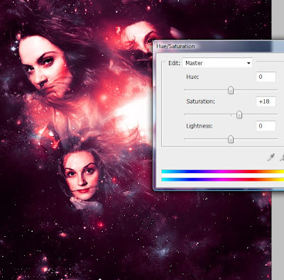
Now Go to Layer > New Adjustment Layer > Hue/Saturation and simply change the Saturation to +18.

Step 28
To further enhance your image (this step is optional) you may flatten your image, duplicate the layer (CMD+J) and then go to Filter > Other > High pass. Set the High Pass at 1.2 (you can play with this number) and then set that layer to Overlay and it should be nicely sharpened ![]()
Final Image
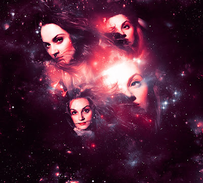
Your final image should look similar to the one below.


