
Step 1
Download the following stock image in order to follow this step-by-step tutorial: if you choose to work on a different plate, try to find a photo with a mostly clear sky so it will be easier to enlarge the photo in the following steps.
Now open your stock of choice in Photoshop and increase the canvas size in all directions except for the ground. First right-click on the background layer in the layer palette and choose the option Layer From Background. Name your layer plate. After that go to Image > Canvas Size and set Width to 3250 and Height to 1450 pixels. Make sure to select the bottom centre rectangle for your canvas extension area in the Canvas Size menu and click OK. The image should now be extended with a transparent background.

Step 2
Now we will start to fill the new transparent area with life. This might turn out to be a very time consuming step if you are not used to working with stock images in this way. Duplicate your plate layer and move the original layer with the Move Tool (V) about 200 pixels to the left where the background is to be enlarged. Make sure the Show Transform Controls in the upper menu is selected and then increase the size of the layer to about 101%. Why do we do this? Have you noticed the thin white line in our stock image? The new area has to blend seamlessly with our original image, therefore we have to move both lines to the same height.
Next we have to get rid of the sharp edges in the upper layer. For this, select your duplicated plate layer in the layer palette and add a Layer Mask by clicking on the Add Layer Mask button below. Select the Brush Tool (B) and pick a large 200 pixel round soft brush to delete unwanted areas of your layer. To do this you will have to set your Foreground Color to black and Opacity as well as Flow to 100%. Then start brushing on your edges while the layer mask is still selected.

Step 3
The left area now obviously looks duplicated, so we will use the Clone Stamp Tool (S) to fix that. First create a new layer on top of all other layers, then grab the Stamp Tool and select the option Sample: All Layers in the upper menu. This way the Stamp Tool will clone areas from all layers, while it will neglect everything except for the selected layer in case the option Current Layer is chosen. Again use a large round soft brush and set its opacity to about 50%. This is a very experimental step, so I recommend that you vary your brush sizes and opacities to get the optimal cloning result. Make sure you press Alt on your keyboard while you select the desired area in your image that you would like to clone. Do so with a single left-click.
After selecting your area, stop pressing Alt and click in your empty layer once again to start cloning. Depending on the direction you are moving with your mouse the Clone Stamp Tool will now recreate elements from the desired area in your new layer. Make sure you do not cross noticeable edges of your image while cloning as it will bring the quality of your result down a lot. With some patience you might get a similar result to mine. Feel free to merge your background layers whenever you are satisfied with the result. Be aware that it is not as simple to correct mistakes afterwards.

Step 4
Use the Clone Stamp Tool as described in step three in order to expand the background on the right as well. This is, again, very experimental. Try to clone some nice cloud formations and blend them as best as you can with your original plate layer by using methods from steps two and three. There is no need to be overly accurate here, as we will cover the sides with photos of trees and bushes later on.

Step 5
Create a new layer and then go to Image > Apply Image with the settings shown in the following image and press OK. We will now fill the empty areas by increasing the size of this layer. Go to Edit > Free Transform and increase the layer size to about 130% until all empty space is filled. The sky in our background is very dusty and grainy so this method does not hurt the quality that much. I usually do not recommend using this technique as it may bring down the quality of an image drastically. In our case the relevant areas will be hidden by other elements at the end, so it does not really matter to us.
Next, add a Layer Mask and erase all the parts in the center where the applied image and original layers overlap each other. That way we will keep the quality and sharpness in the central areas high. Like in step two, try to blend your layer as best as you can. You might want to use the Clone Stamp Tool again in order to fix all bad transitions, which you do not plan to cover with other elements in the end.

Step 6
In this step we will fill the canvas with more chimneys. Again go to Image > Apply Image as explained in step five. After that select Edit > Free Transform and rotate your layer 60 degrees clockwise. Then erase the chimneys but keep the smoke. We will add new chimneys instead to add variety to our scene. I have used the following stock photo: chimney.
Drag this layer into your file and erase everything except for the chimney. You can use Adjustment Layers to blend the stock photo with our original plate. Create a new Adjustment Layer by clicking the fourth button at the bottom of your layer palette and choose Hue/Saturation from the menu. Our other chimneys have a dark purple color, so adjust the colors as followed: Hue = -108; Saturation = -43; Lightness = -14.
Right click on your new Adjustment Layer in the palette and choose Create Clipping Mask. Make sure your Hue/Saturation layer is right upon your chimney as a Clipping Mask only affects one single layer and not the entire image. Repeat this step if you need to add more chimneys. You may want to set the Blending Mode of your chimney layer to Darken in order to blend it nicely with the background (do not forget to extract it with a layer mask or whatever technique suits you best). I also reduced the opacity to about 40%. It is reasonable that objects in the distance are covered with a lot of dust and haze, which is why we have to decrease the contrast to create the illusion of depth.

Step 7
Use the Clone Stamp Tool (S) described in step three to compliment the smoke on the right with additional clouds. However, pay attention to lighting and shading of the smoke while cloning areas. Concerning other objects in our image, the smoke clouds should always be lit from the right. In order to blend elements properly you always have to keep track of your color of light and shadows, as those are essential for a coherent image and realistic atmosphere.

Step 8
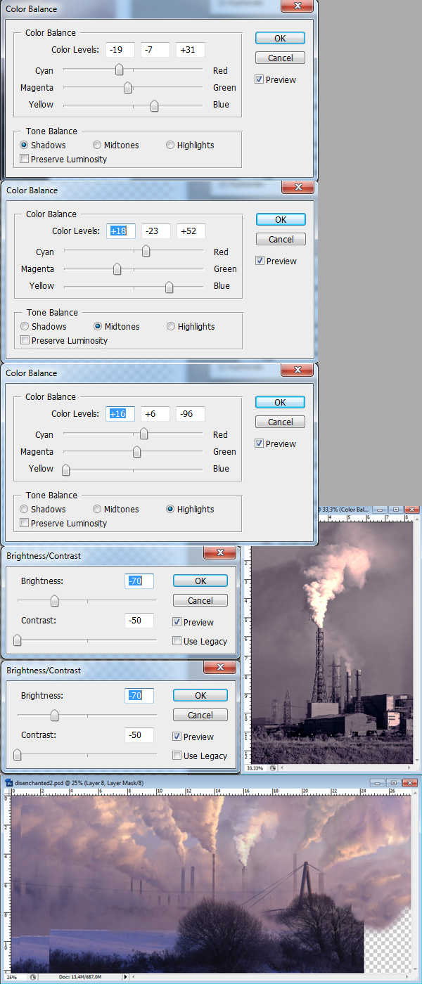
Apparently there is enough empty space for another chimney. Download the following stock image which appears to have similar lighting conditions: chimney2. The photo is desaturated, so we will have to recolor it. Open the stock photo and go to Image > Adjustments > Color Balance and Image > Adjustments > Brightness/Contrast to adjust the image with the following settings. Start with Color Balance and then do brightness adjustments. Do not change this order as it will alter your results greatly! After that drag the photo into your work-file and erase all unneeded areas. I recommend extracting it with a large round soft brush at different opacity levels.
Step 9
The new chimney does not blend very well with the scene yet, so we will apply a couple of additional adjustments. Firstly, create a new layer on top of your new chimney and set the Blending Mode to Soft Light. Pick a small soft round brush (about 20 pixels) and turn the Opacity of your brush down to 30%. Set the Foreground Color to white and then brush over the right of the chimney to brighten it according to the direction of our light source. Secondly, create a new layer, set the Blending Mode to Multiply and now brush over the chimney in order to darken it. This time be careful with your brush opacity as the Multiply Blending Mode tends to work more effectively than the Soft Light mode. Set the opacity to about 10% and change the Foreground Color to black or dark grey. Thirdly, create another new layer, again set its mode to Multiply, but this time grab a larger soft brush (about 100 pixel) and set the Foreground Color to #f0b5aa. By brushing over the smoke we will mainly adjust the colors of its highlights and therefore change the reflection of light. Depending on your result you might want to experiment with the layer opacity as well. Try to get a similar result to mine by varying brush sizes and opacities.

Step 10
Our image still looks awkward, but we will now finally add the missing foreground elements! Feel free to look for tree and bush images yourself. You may also download the following: 1, 2.
First open stock image #2 and drag it into your work-file. The layer should be on top of everything else. Due to the fact it has a white background it can be extracted fairly easily. Go to Select > Color Range and make sure Sampled Colors are selected in the drop-down menu. Then click left into the white area of your layer to get the right color with the Eyedropper Tool. Set the Fuzziness to 95, activate Invert and click OK. After that directly apply a mask to this layer by clicking the third button at the bottom of the layer palette. If you did everything correctly, the branch should now be almost entirely extracted. You will most likely see some awkward white lines around it. Don’t worry about them for now because first we will apply a few color and lighting adjustments.

Step 11
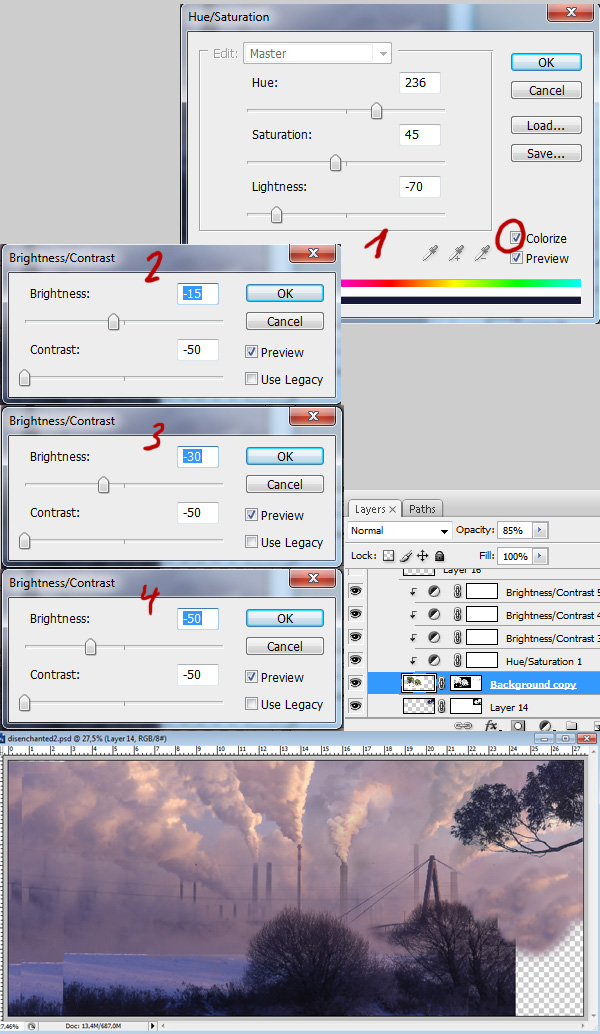
The most important aspect of a matte painting is that all elements in our composition have similar lighting conditions. The easiest method to blend your stocks properly is to check highlights and shadows of your original plate and adjust the new elements accordingly. In our image the foreground elements (the bushes) are very dark, so we must decrease the contrast of our branch a lot to ensure that it blends nicely with the scene. Click on the fourth button in your layer palette and add the following Adjustment Layers (see image below). Once again make sure you don’t change the order. After that turn every Adjustment Layer into a clipping mask applied to your branch as described precisely in step six. Lastly set the Opacity of your branch layer to 85% and change the blending mode to Darken. Hopefully all white edges are gone now.
Finish this step by mirroring the branch layer with Edit > Free Transform and then move it to the upper right corner until you are satisfied with the composition.
Step 12
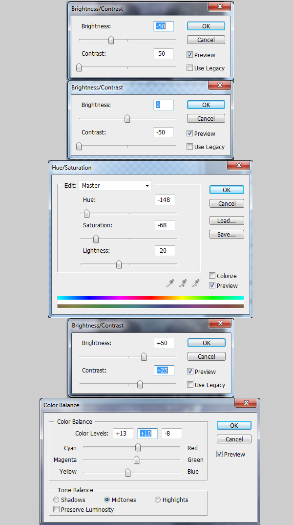
Now open the other stock image and try to change the color of the trees to a dark and desaturated purple with less contrast. I recommend to experiment with adjustment layers yourself. If you can’t get a similar result, use the following settings and drag the finished product into your work-file. Put it below the branch so that the tree layers overlap each other nicely. Set the blending mode to Darken. In this tutorial we will only use the right half of that stock image, however, feel free to make use of the left half as well.
Step 13
This needs more work on blending: Select the tree layer and then erase the red marked areas with a big round soft brush and brighten the green marked parts with the Dodge Tool. Make sure the Dodge Tool is set to Midtones with low Opacity (something around 15% will do it). Dodge the upper tree leaves until they disappear behind the branch we added in step 10. Do not overuse the Dodge Tool, though, as it also desaturates your stock image in the process. If the leaves appear to be too desaturated afterwards you might want to adjust them with Image > Hue/Saturation again.

Step 14
There is still a small area to the left which needs to be fixed. Create a new layer upon your tree layer and set the Blending Mode to Color. Now pick a purple color from the background with the Color Picker Tool (I chose #a08999) and brush onto the yellow marked area. After that turn the layer into a Clipping Mask and set the layer Opacity to 75%.

Step 15
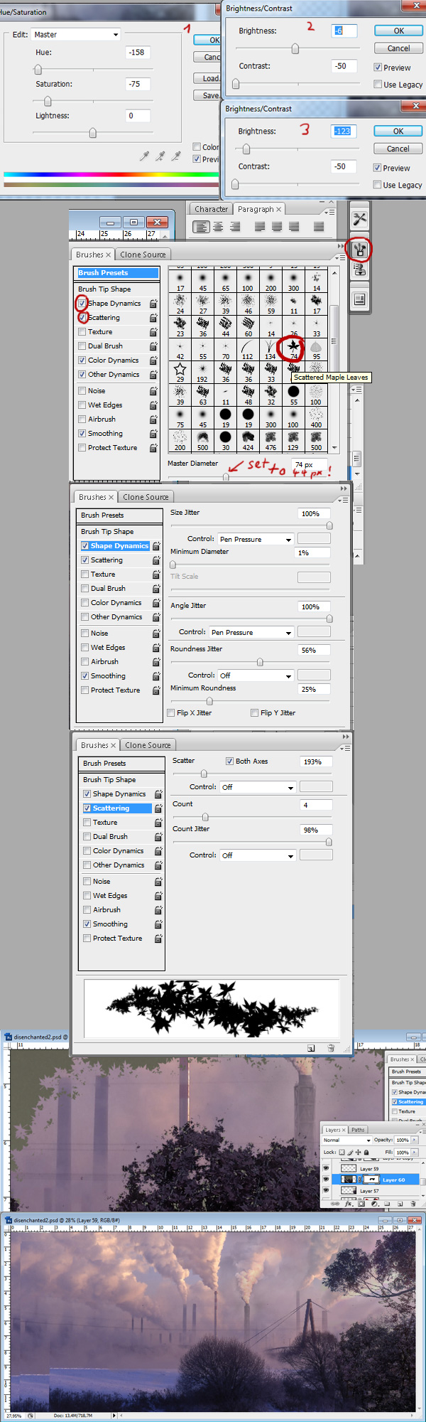
As you might know cutting stock images of trees can be really exhausting. I have a special technique that is very useful for extracting images with leaves or any other random and sharp pattern. Download the following stock image and adjust the colors and contrast as described prior: stock. Drag this image into your canvas and position it as you like. Now add a Layer Mask as explained in step two and grab the Brush Tool (B). Photoshop comes along with a lot of nice default brushes. We pick the leaf brush: Scattered Maple Leaves and set the size to 44 pixels. Check the attached images if you are unsure of what brush I am talking about. Also the settings for Scattering and Shape Dynamics are really important. Choose black as your Foreground Color and then draw into your Layer Mask to extract the leaves. You will notice that this technique is not very accurate, so you might want to vary with scattering, brush size and opacities in order to get a better result. This method works best for objects with a random pattern, and a graphic tablet can be of great use, too. In case the contrast of this layer comes off as too high, set the Opacity of this layer to about 80%.
Step 16
Keep adding more trees and bushes in the foreground with the techniques listed in steps 10 to 15. Most importantly try to cover all the flawed areas which are still left. Also keep in mind that the basic composition tends to be central/symmetric, so try to fill equally as much space on the left as we did on the right to keep our composition in balance. Do not just simply copy + paste the existing layers. Matte Paintings have to be as realistic and convincing as possible, so any repetition in our scene will hurt the atmosphere of our piece badly.

Step 17
Now we need to fix some lines that disappear in our painting. This is very easy to do if you own a graphic tablet, if not use the Pen Tool (P) to create perfect lines. First create a new layer, then switch to the Pen Tool and click once for the starting point and a second time where you would like to end the line. Click and hold your mouse and then move it around to create perfectly curved lines. Before you go on, pick the Brush Tool and set the brush to Hard Round 3 pixels. After that choose your Foreground Color with the Color Picker Tool and pick up the color of the already existing lines, which should be #857082. Now switch to your Pen Tool again – make sure the paths are not gone yet – click right on your image and select the option Stroke Path. Select Brush from the drop-down menu and click OK. Finally deselect the path and repeat this step for all other missing lines.

Step 18
Since the basics of your image are done, all the following steps are optional. Feel free to proceed to step 20 where final touch-ups are made. In this step we keep adding more details to our composition to create more levels of depth and some interesting eye catchers. Let us start with adding more factories in the background. Download the stock image and make use of the fact that it has a dark silhouette on a bright background. In this case the Blending Mode Darken works very well. Try to brighten the sky of your stock image until it is brighter than the background of our work-file, but at the same time keep the silhouette dark, so that it will not disappear when we switch the Blending Mode.
Additionally, do not forget to change the color to purple with Image > Adjustments > Hue/Saturation. Use the attached settings if you are unsure. You may place the factories several times in your background, always using different elements of your stock image in order to keep variety. Keep in mind that your composition has a lot of distance haze, so the new factories should be similar in contrast to the already existing chimneys. It can be helpful to reduce the layer Opacity to a value of 60%.

Step 19
Add some animals to your composition and bring your picture to life in order to make the scene more convincing. Also think of any other details that may support your concept. Our image represents the typical conflict of nature and technology, so a good idea could be to search for images which present deforestation, for instance rotten trees or tree stubs. Some of these stocks can give you an idea of what I am talking about: 1, 2, 3, 4. Always pay attention to your light source while adding new elements. Use Adjustment Layers and Blending Modes to blend your images according to your light source.
I will give you one more example: Extract the tree stub and place it in your image where you like it best. Don’t forget to change the color to purple. Now create a new layer on top of your tree stub and turn it into a Clipping Mask. With the Color Picker Tool selected pick up a color from the highlights of the smoke in the background and then brush on your new Clipping Mask with this color to add highlights to your tree stub. Switch the Blending Mode of your Clipping Mask to Overlay.
Apply this technique on all other objects you would like to add. Experiment with the Blending Modes as the result always varies depending on the photo which you are planning to use. I can recommend the Blending Modes Soft Light, Overlay, Screen and Color Dodge for all actions which imply adding highlights to your composition.

Step 20
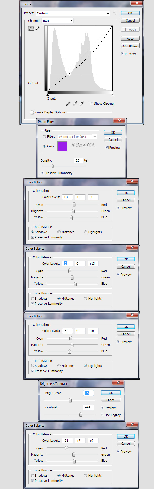
This is almost the final step. In this step we are going to add a lot of color and contrast Adjustment Layers, which will completely change the atmosphere of our image. The final result will look much more like an actual artwork rather than a photo-manipulated stock image. First we start off with a Curves Adjustment Layer in order to improve the contrast. Create new Adjustment Layers on top of all other layers with the following settings.
Step 21
You can stop here if you like this surreal night scene. Otherwise add some more Adjustment Layers as we are going to turn night into day with this step.

Step 22
There is a small area to the left which pops out with blue color. Fix this area by creating a new layer and setting the Blending Mode to Color. Pick up a desaturated brown color (#6b6254) and then brush over those parts which have to be recolored. After that decrease the layer Opacity to 75%.
Furthermore, we are going to add some light rays. Create a new layer, select the Paint Bucket Tool (G) and fill it with black. Then grab a big round soft brush and pick a bright orange color. You can now draw diagonal orange lines onto your black layer (in case you own a graphic tablet), or click once with your mouse into your black canvas and create a big round circle. Then go to Filter > Blur > Motion Blur. Set Angle to 45° and Distance to 999, then press OK. After that set the Blending Mode to Linear Dodge, which will result in some nice lighting effects. Move your layer around and erase the parts which you do not like. You may also duplicate and distort this layer if you want to add even more light rays. That is all up to you.

Final Image
When you are finished, your image should look something like the image below.


