TUTORIAL : DIGITAL KOLAJ JAKET KERTASTutorial ini menunjukkan bagaimana untuk mengawal penempatan pola untuk menggabungkan gambar ke latar belakang, sebagai latar belakang. Hal ini juga menunjukkan bagaimana membuat pola yang sama ke tekstur realistik di beberapa bahagian. Mari kita lihat cara2 nya untuk melakukannya.
 klik to view full image
Step 1
Download the two photos we’ll be using for this tutorial: model and torn paper. I downloaded the medium size. Now create a document 1132px by 1696px (these are the same dimensions as our model pic).
 klik to view full image
Place our texture background in the back and turn its visibility off for now. Also, place a copy of our model photo behind and hide it as well, as we will be using a destructive editing technique, so it’s good to keep a copy. We’re going to use techniques found in this video to extract the model from the background.
Select the "model layer" in the Layers palette. Then go to Filter > Extract. Grab the Highlighter Tool and outline the hair with an 80px Brush Size. Outline the rest of the model with a 10px Brush Size, zoom in when necessary. Then grab the Fill tool and Click inside the image. Then hit OK. The result is the last in the series below.
Tip: We use the Extract Filter because it gives us professional results quickly. After applying the extract, use the History Brush Tool if you need to clean up the extraction. See the video link for an example of this in action.
 klik to enlarge
Turn the "texture" layer’s visibility back on, and the background is now replaced. Notice how this texture isn’t quite long enough to fill the entire background. The lower left and right corners are not filled. We’ll need to account for this in later stages of the design process.
 klik to enlarge
Now let’s start building our Camouflage Collage Jacket. We’re going to break it into six parts. This will give us some flexibility. You could choose to break it up into more or fewer parts. I chose to use vector masks. This was chosen because we’re using a collage style. The vector masks give hard-edged cuts. It fits the style of what we are looking for. We will work from back to front. Let’s start with the left side.
Copy the "texture" layer. Then position it behind the left side of the jacket. Make sure this layer is selected. Then grab the Pen Tool (P). Make sure that Paths are selected. The Paths button is located in the top left-hand corner of Photoshop’s interface. Start drawing the shape of the left side of the jacket. Keep in mind what will go in front of this layer. This will help with deciding the path. Also, overshoot the original jacket a little, as you don’t want the original tan jacket to show in the final design.
Once you’ve drawn the mask, Ctrl-click and select Create Vector Mask. Then name the layer "left_side." Position the new layer in front of the model. Then add to the mask. Make sure the Vector Mask Thumbnail is selected. Then draw in the small patch at the bottom of the design, as shown in the last image below.
Be careful of which area you choose to use from the background, as some areas of the texture image are blurry. Those areas wouldn’t be the best to put into the jacket. Notice how we changed the jacket path to be a bit larger in the left-hand corner. This hides that area where the background ended.
 klik to enlarge
Now we will draw the left arm. Make another copy of the "texture" layer. Then position it behind the left side of the jacket. Again, draw a Vector Layer Mask, using the same process as in the previous step. Once you’ve completed, name the layer "left_arm," and move it to the front.
Tip: you may want to turn the Visibility of the "left_side" layer on and off while drawing this path. Ultimately, the "left_arm" layer should slightly overlap the "left_side" layer. Also, notice how we placed the texture in a different position than when we created the first mask. This further separates these two areas. If you prefer this to look flatter here then mask the texture in the same position as the "left_side" layer.
Step 6Let’s draw the left jacket lapel next. Make another copy of the "texture" layer. Then position it behind the left side of the jacket lapel. Again, draw a Vector Layer Mask, using the same process. Once completed name the layer "left_lapel," and move it to the front. There are three pieces that make up the left lapel mask. The progressive process of making this mask is shown below.
 klik to enlarge
Repeat this process of creating Vector Masks for each piece of the right side of the jacket. Name the right pieces "right_side," "right_arm," and "right_lapel." Then position your textures the way you want them to look in the final design. On the right side, be sure to account for where the texture ends, and make the "right_side," layer cover up the missing texture spot.
You can unlink the mask from a layer in the Layers Palette. There is a little chain link icon that can be toggled on and off. When toggled off you can reposition the texture of the layer without moving the mask. You want to do any repositioning now, as we’ll be using the Burn Tool in the next step. This tool works directly with pixels, and therefore is irreversible. I also repositioned the background a little.
You may also want to save a copy of the document at this point as well, in case you want to return to this stage of the design. To do that go to File > Save As, and in the dialogue box check As a Copy. I named my copy "flat_masks".
 klik to enlarge
Now we want to decide which areas of our image to give volume to and which areas to keep flat. We want the camouflage to be strong in parts of the image. The strategy for this design is to have some parts look like an actual jacket, and others blend into the background as flat texture. This confusion of foreground and background adds interest to the image. We want a good mix of the two. The lapels will be the focal point. We’ll give them a full shading treatment.
We will predominantly use the Burn Tool (O) to brush in our shading. Once that tool is selected, choose a soft brush with a size between 40px and 80px. You can tap the left and right brackets ([ ] )on your keyboard to quickly increase or decrease the brush size. The options for this tool are located in the top left-hand corner of Photoshop’s Interface. Focus on the Range of Midtones mostly here, but if you want to make the Shadows or Highlights darker you could choose those Ranges as well. I also left the exposure at 50 percent. Keep in mind if you overdo it, you can grab the Dodge Tool, and lighten the image again.
Now Burn areas of the lapel with the Burn Tool. Focus on the outer edges. Turn off the texture and look at the original jacket. Take clues from the shading done to the original jacket, though feel free to differ when it makes sense. For the most part, significantly darken the inner edge of the lapel. Then darken the outer edge a little bit to create a curvature on the lapel.
The images below show the right lapel being created. Notice how we start with shading the inner shadow on the lapel. Then we move on to add some shading to the outer edge of the lapel. Overall a larger brush can be used on the inside. Then drop the brush size down a bit for the outside edge. The last image shows how the Burn Tool adds shading to the lapels. They now appear curved and are no longer flat.
 klik to enlarge
Now we will burn the "left_side," and "right_side," layers to add some emphasis to the lapels. We will also add shading in the sides. We’re going to let the left side blend into the background, but shade the right side more. The arrows in the images below show the areas shaded the most. The final image in the set below shows our results so far.
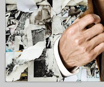
 klik to enlarge
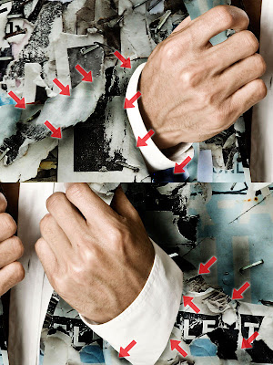
Let’s give the sleeves some volume. We’ll be using the Burn Tool on the "left_arm," and "right_arm," layers. The arrows below indicate where most of the shading was placed.
 Kesimpulan
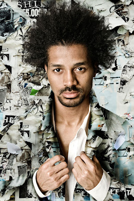
Now that we have composed the image, go in and make any final adjustments. There is great variation that can be achieved with this type of design. It depends on how much volume you want areas to have, or if you want some areas to appear more flat. Consider using this kind of collage-style camouflage technique in one of your own designs. The final image is below.


 klik to view full image
 klik to view full image
 klik to enlarge
 klik to enlarge
 klik to enlarge
 klik to enlarge
 klik to enlarge
 klik to enlarge
 klik to enlarge


